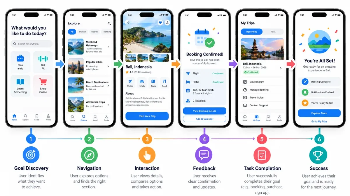

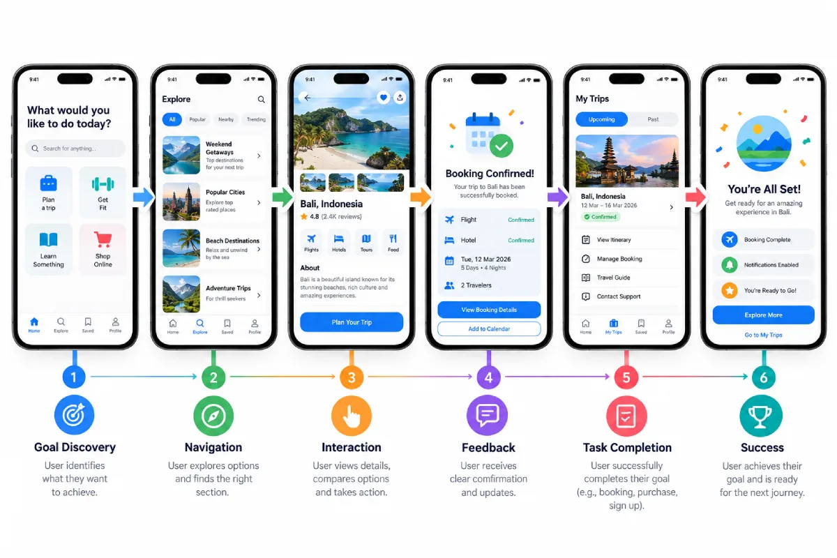


The user experience (UX) of a mobile application is concerned with how users experience the application when trying to complete a task.
UI is what users see, while UX is the overall experience of searching for information, app navigation, performing actions, recovering from mistakes, and achieving one‘s goal.
Good ux on the mobile devices should come across as intuitive, not difficult.
Table of Contents
Start With User Needs
The first principle – ‘Build for the people using the App’ is straightforward.
Understand:
- What they wish to achieve
- What problems they face.
- ~3~ What information do they require
- What may draw them to confusion.
- What really matters in work
Design decisions should relate to real user needs, not to an assumption.
Make the Main Task Clear
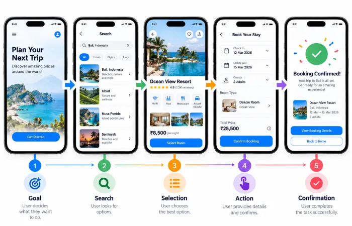
All key app flows should have a defined intention.
For example, in a banking app, users may want to:
- Let‘s check the balances of …
- Transfer money
- Pay a bill
- Review transactions
Here all of these actions shall not hide behind any complex navigation.
Reduce Unnecessary Steps
Why are users required to make five steps where two would suffice?
Examine typical flows and eliminate screens, fields, or decision points that are not needed.
For example:
Select item → Add to cart → Proceed to checkout
May be preferable to multiple confirm screens.
Build Predictable Navigation
Good UX is easy to get around.
Users must know where they are and what they are getting ready to do.
Navigation patterns should not be flexible throughout the app but consistent; navigation from should be from. screen to screen.
Provide Feedback
There must be some sort of response to all significant interactions.
Games should provide immediate feedback when a button is pressed, a form is submitted, a goal has been achieved, or data has been saved.
Feedback closes the loop of uncertainty and clarifies the connection between user action and system response.
Prevent Errors
Good UX not only accounts for errors after they occur. It actively seeks to prevent them.
Examples include:
- Unable to perform invalid actions
- Indicating the necessary fields of information
- Specification of destructive behavior
- Offering Effective Input Formats
- Verify data before submitting
When an error occurs, it should be explained to the user what actually took place and if available how to correct it.
Keep Important Information Visible
Not Require Users to Remember Information They Have on One Screen to Use on Another.
Always preserve important context by displaying it within the text where it is useful.
For instance, a checkout screen should allow you to quickly see the contents of your order, prior to making payment.
Design for Different Contexts
Can take place even people walk, stand, go. Few things can be used by people are to-do in background, multi-task; use in meanwhile or using in a bad network area.
UX design should be aware of these.
And that is where flexibility comes in. Apple’s Human Interface Guidelines on this point currently reads: “Make your app flexible so it gets out of the way and provides a good experience for a variety of contexts and needs.”
Think About Accessibility
A usable experience must be functional for as many people as practically possible.
Take into account legibility, contrast, well-defined labels, interaction by touch, and accessibility professionals.
Accessibility is about much more than just technical compliance. It also makes life easier for many users in real-world scenarios.
Use Familiar Patterns
Users comes with expectations learned from other apps.
Re-inventing navigation, menus, search or form behaviour is not always necessary.
Familiar patterns simplify the mental process of understanding and allow the user to concentrate on the task.
Test the Experience

UX decisions need to be verifying, not assuming.
Provide the users with tasks, and observe how they use the prototype.
For example:
“Locate your prior purchase and order the same again.”
Observe delay, wrong taps, repetitions and questions… What to do and how to do?
These observations are more informative than asking questions regarding whether or not someone “likes” the interface.
Final Thoughts
Mobile UX Design Principles Good mobile UX is built on clarity, efficiency, consistency, feedback, accessibility, and a clear understanding of the user.
No amount of beautiful interface can make up for an inessential experience.
Begin with what the user needs to accomplish, plan out a satisfying and straightforward route to the goal, eliminate any extraneous requirements, and then pilot the whole experience through a prototype prior to production.