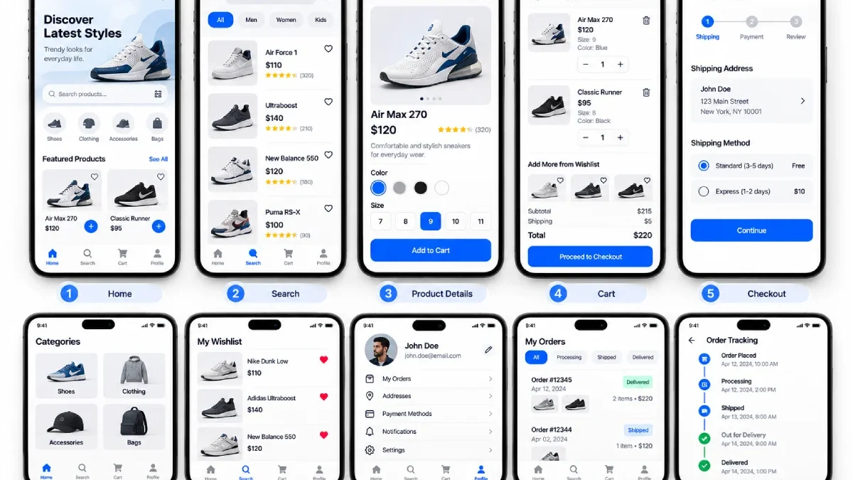

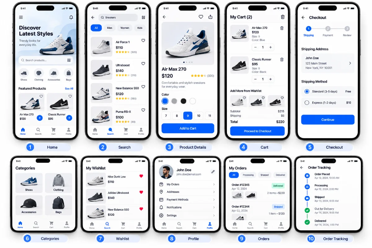


A mobile application can be great and frustrating at the same time if its front-end is not clearly laid out.
A well-designed mobile UI guides you to the most important actions and provides a clear throughline of information with predictable interactions. The best, most functional UI is not necessarily the most glamorous, but the one that enables you to get your work done efficiently.
Table of Contents
Keep the Interface Simple
Begin by getting rid of anything irrelevant to the user‘s goal.
Do not over crowd a small mobile display with multiple buttons, icons, labels or visual effects.
A clear interface creates space for destacado content.
What Apple has to say Simplicity is about bringing order to complexity and removing duplication and ambiguity from experiences.
Create a Clear Visual Hierarchy
This is not to say that every element should be focused on equally.
Prioritize by size, position, spacing, weight and contrast.
For example:
Page title
The font type is large and clear
Main information
Quick to scan
Primary action
Visually prominent
Secondary actions
Less dominant
So users can see the items that matter most.
Use Consistent Components
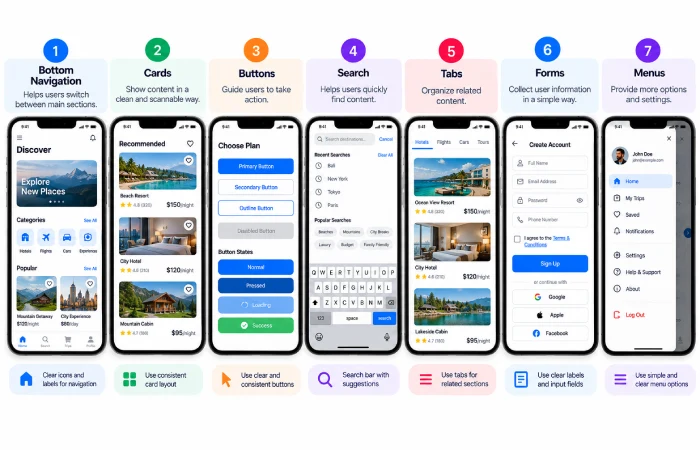
Transition of buttons, cards, input field, menus, etc. must be smooth.
In the case where pressing a button with the style ‘continue’ on one screen means the same thing should it mean something else on the next?
Consistency decreases the learning required by the user.
Make Navigation Easy to Understand
The navigation need to correspond to the framework of the application.
Users should know:
- They are there…
- The places they can go.
- How to send back
- What the main sections are
Don’t hide your navigation behind anything you don’t have to.
Design for Touch
It should be noted that interfaces for mobile applications are controlled differently than those for desktop use.
Controls that are significant require people to have adequate room to use them comfortably.
Consider:
- Tactile Target Area
- Spacing of controls
- Thumb reach
- One-handed use
- Scrolling behaviour
- Accidental taps
A control that appears visually manageable may, despite its appearance, be difficult to operate.
Use Typography Carefully
Typography purpose is to facilitate readability.
Choose a limited type system and use clear differences between:
- Titles
- Headings
- Body text
- Labels
- Supporting information
Don’t overload your interface with multiple font types.
Good spacing between the lines, between sections or examples can greatly contribute to the readability of the text.
Use Colour With Purpose
ColoUr should be used a supporting feature and not the centre of aU programme.
Apply consistent colours for actions, states, alerts and other relevant information.
2. Use colour as a supplement not as the primary communication means. For example, an error should not simply be marked in red a message or icon can make it more explicit.
Design for Different Users
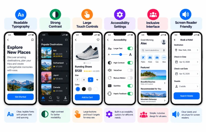
Accessibility ought to be a part of your UI planning, and not an afterthought.
Consider:
- Readable text
- Sufficient contrast
- Clear labels
- Thinking beyond states: alternative approaches
- Screen-reader support
- Various needs of interaction.
Apple‘s present set of guidelines also discusses inclusivity as a key aspect of designing applications and urges the designer to envision different types of users.
Give Users Clear Feedback
The user must be informed of the outcome of any action.
Examples include:
- Something that toggles when pressed (I have created my own example which switches between different characters)
- A loading icon
- A success message
- Validation feedback
- An error occurred
Without feedback, it’s frustrating to repeat actions or think that the app is broken.
Keep Screens Visually Balanced
Don’t design all at the top or all at the ‘big’ empty space.
Separate the sets with a working space.
A good layout leads a comfortable natural visual path across the screen.
Another layout design that Apple currently guide is for creating consistent layouts that play to their strengths whether they are used in different contexts or on different devices.
Test Before Development
What appears right in the design file of a UI doesn’t necessarily translate to reality.
9 Test critical screens with actual users and interaction.
Pay particular attention to:
- Navigation
- Forms
- Search
- Checkout
- Error states
- Important buttons
- Empty states
Final Thoughts
Effective mobile UI design centers on clarity, consistency, touch-optimized interface, easily digestible content, and meaningful feedback.
A good interface doesn‘t have to show users a visual fine arts exhibition. It must be able to communicate to them how to operate and make them do so.